Welcome to the strange end of the high street
The Curiosity Shop.
Where I try things before I trust them.
The garage next door only stocks what has survived. This is where things earn their way in — experiments on one shelf, and the work they grew into on the next.
Figma → Braze, hands-free.
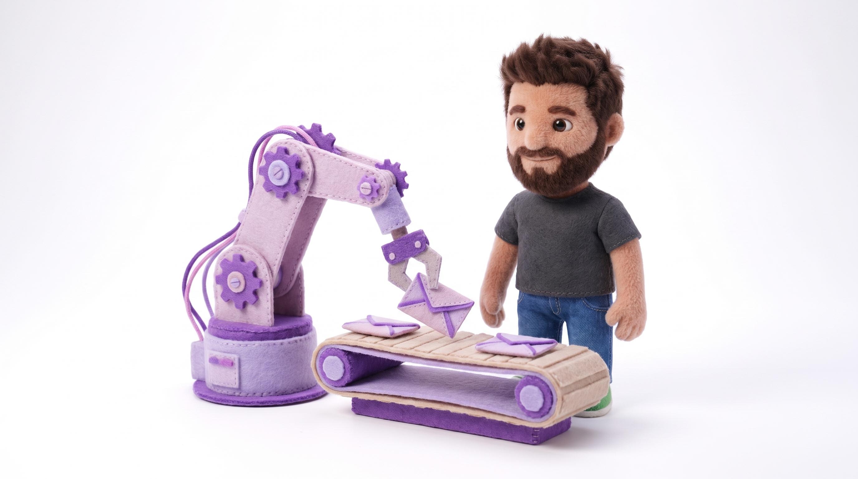
The experiment that killed the production queue: a robot arm that reads the design file and builds the campaign.
01 — The problem
Approved creative sat in a queue for a week — exporting, rebuilding as HTML, re-running the same QA. The tax was so predictable that good ideas were killed before anyone costed them.
02 — What we built
A pipeline that starts in the design file: reads the approved Figma, composes regional HTML, QAs every variant, publishes to Braze, then pixel-diffs the result against the design.
03 — What changed
A week became four hours, ninety per cent automated. Humans kept the one step that deserves them — review — and the team says yes to ideas it used to decline.
01
Read creative from Figma
02
Export retina-ready assets
03
Compose regional HTML
04
QA per region & language
05
Publish as content blocks
06
Pixel-perfect visual QA
Arm idle — scroll it into view to run
Before
1 week
After
0 hours
Execution automated
0%
Humans keep review & testing — the arm does the rest
The arm freed up the week. The next question was what to do with it — and the wall had been listening the whole time…
Agentic analytics on the MCP stack.
Lifecycle questions used to die in a ticket queue — an analyst, three days, an answer arriving after the moment had passed. So the workshop taught something to watch its own gauges: agents on an MCP layer over Segment, Redshift and Braze. Ask it yourself.
Put a question to the wall
The gauges rest until somebody asks.
A diorama of the production system, canned answers and all. The real wall runs agents over MCP against live Segment, Redshift and Braze — same three dials, real numbers, inside the meeting that asked.
Knowing who to write to is only half of it. The other half is being worth opening…
B2B email that refuses to be boring.
B2B email is a genre written for “a business” — and businesses don’t read email. People do. Three real letters from the Prezzee Business rack, hand-built HTML end to end, each pinned with the move it makes. The letters do the talking; they scroll to their footers.
Three letters off the rack — they scroll, top to footer
Engage
Lead with interest, not with “Dear valued customer”. A tired human gives you two seconds; this earns the third.
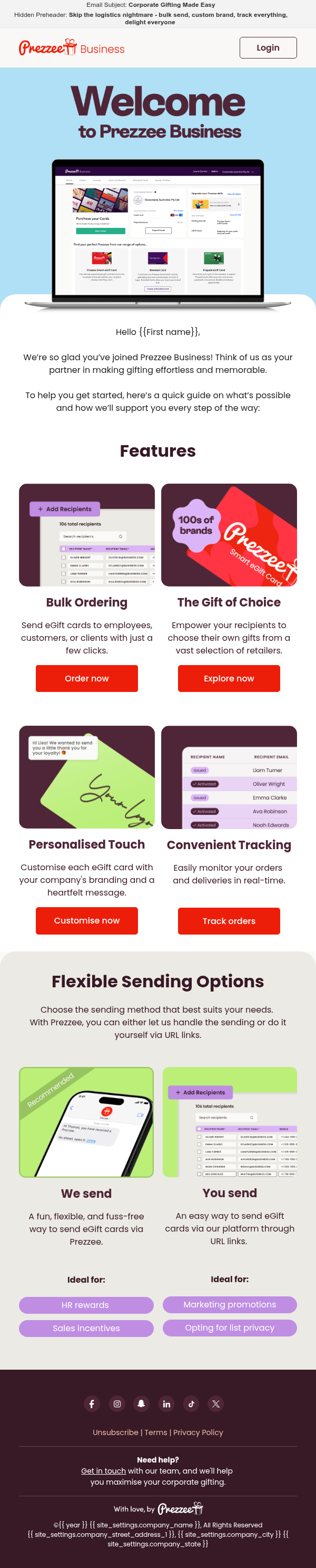
The welcome — day one at the counter
Activate
Walk to adoption in clear steps. Every block answers the next question before it gets asked.

The pitch — why partner at all
Educate
Cart abandonment, personalised from the purchase itself — it knows what was left on the counter, and teaches exactly enough to finish the thought.
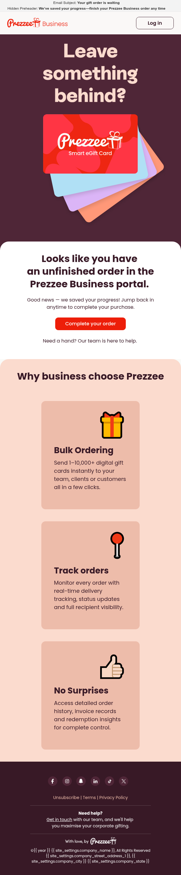
The nudge — an order left on the counter
One good letter is craft. Thirteen of them in the right order is a lifecycle — if anyone can actually see it…
One view of the whole lifecycle.
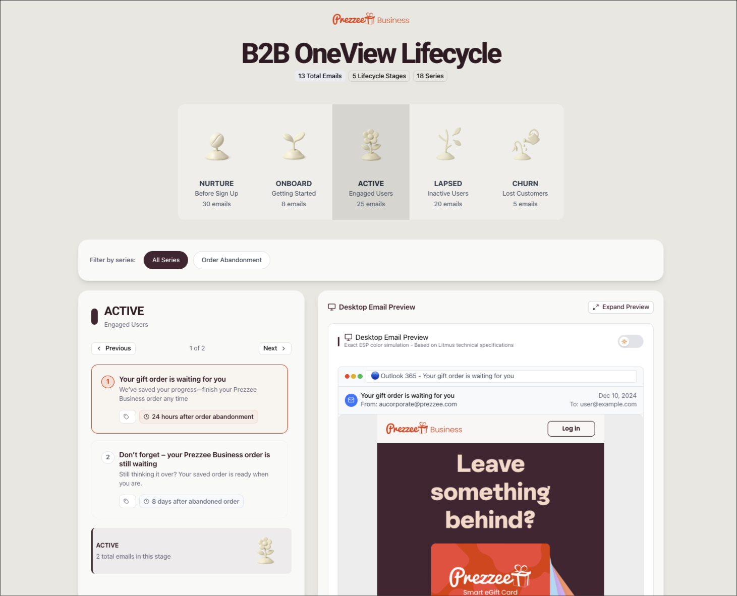
Everyone swears they know the customer journey; ask to actually see it and you get fourteen spreadsheet tabs from two re-orgs ago. OneView replays the journey the way customers live it — every message, in sequence, on one screen. Don’t take the density on faith: the lens is real, sweep it.
Every message so far waited in an inbox. The last one happens while they are already holding the phone…
In-app messages, on steroids.
The shop’s lantern show: real reels from the Prezzee app, projected on the screens they actually played on. Mini experiences that spark action — not notifications with delusions.
Slide 01
The in-app message is where brand goes to die — a grey rectangle whose loudest line is “Not now”.
Slide 02
Absurd, because it is the most valuable square inch in the stack: the customer is already in the shop, phone in hand.
Slide 03
So craft them like campaigns — animated from the customer’s own data, personalised to the moment. Engagement lands well above benchmark.
Every tool in the garage started here.
Curiosity is not the opposite of discipline. It is where discipline goes to find its next job.
The Curiosity Shop — Rafael Washington · Sydney, AU